Brand ········ Fruna
Type ········· Designer at Brandlab™︎
Published ···· 2017
Category ····· Identity & Packaging
Type ········· Designer at Brandlab™︎
Published ···· 2017
Category ····· Identity & Packaging
Fruna®
Fruna is the oldest and most beloved delicacy of Peru. It was popularized to such a level that it marked an entire generation, even the name of the brand became the generic name of the category of chewable candies.
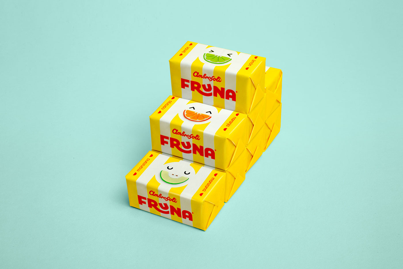

We create an identity rescuing the iconic colors and elements of the brand, we work the illustrations of the fruit modeling plastiline to give it a more modern, sweet and fun brand personality.
Frunacatoinga is the renowed tagline of the brand and it means rebound, it is jumping, it is nostalgia. All this was the inspiration for the great (and dangerous) challenge of redesigning a brand as beloved as Fruna.
Frunacatoinga is the renowed tagline of the brand and it means rebound, it is jumping, it is nostalgia. All this was the inspiration for the great (and dangerous) challenge of redesigning a brand as beloved as Fruna.


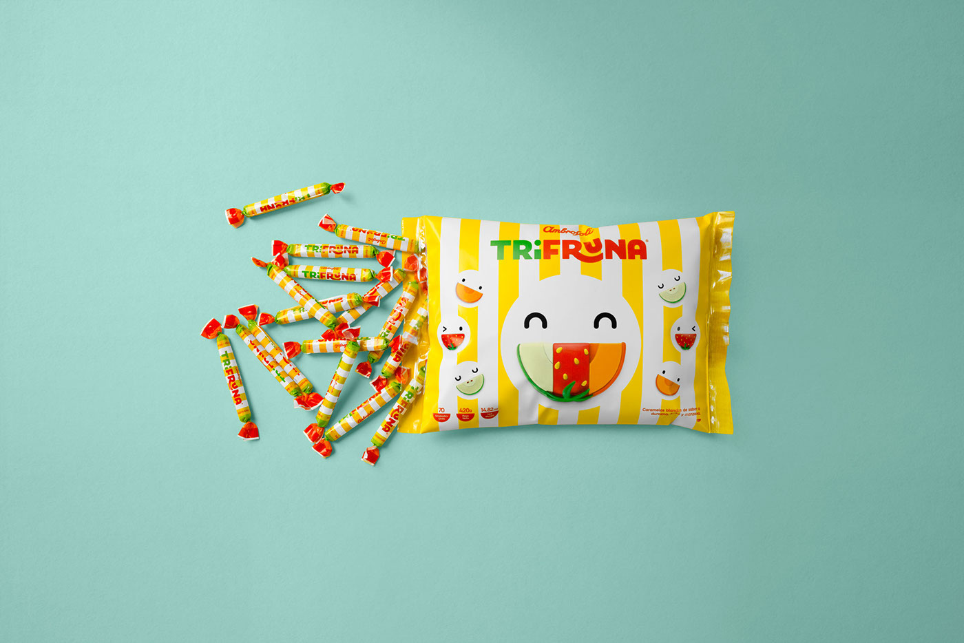
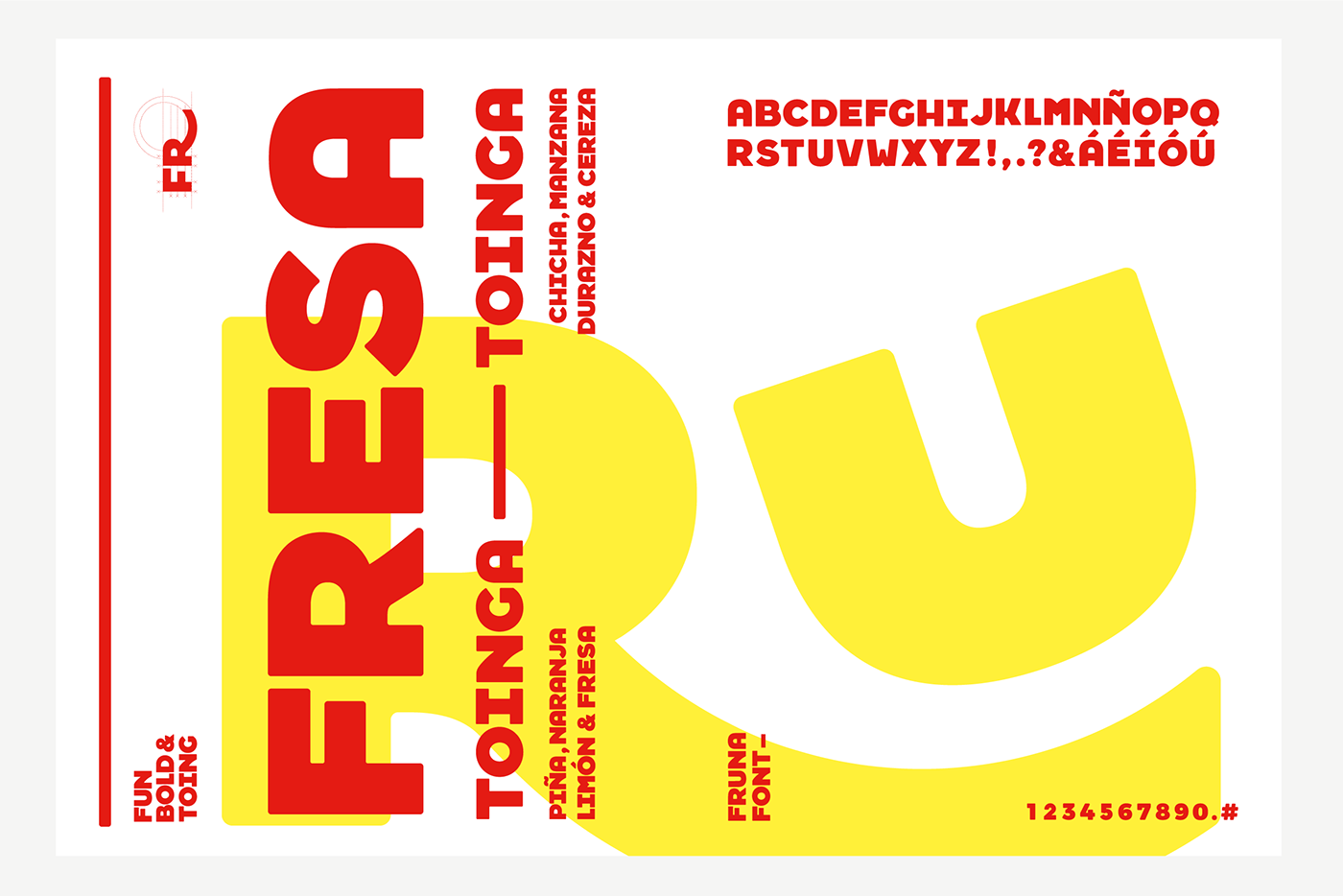
We rescue what made the brand shine. We create an identity by returning to the colors and iconic elements of the brand, we work the illustrations of the fruit modeling plasticine and thus give it a more modern, sweet and fun look. We design our own typeface to name and order the different flavors and varieties that the brand has.

︎Check some more︎